The Art of Framing: The Ultimate Guide from Selection to Display
Why the border matters just as much as the picture itself.
Introduction: Meaning Beyond the Border
When we talk about home decor, picture frames are often the unsung heroes. We spend hundreds on fine art prints and hours capturing memories, only to skimp on the final step: framing.
In reality, a frame is a “visual anchor.” It focuses the eye, enhances color, and bridges the gap between 2D art and 3D living space. A good frame transforms a simple poster into a gallery-worthy piece.
Today, we dive deep into everything you need to know about frames. Whether you are a minimalist or a vintage lover, this guide will reshape your understanding of wall aesthetics.
Chapter 1: The Language of Materials
The material of a frame dictates its personality. Choosing the right “skin” is the first step.
1. Solid Wood: Warmth and Timelessness
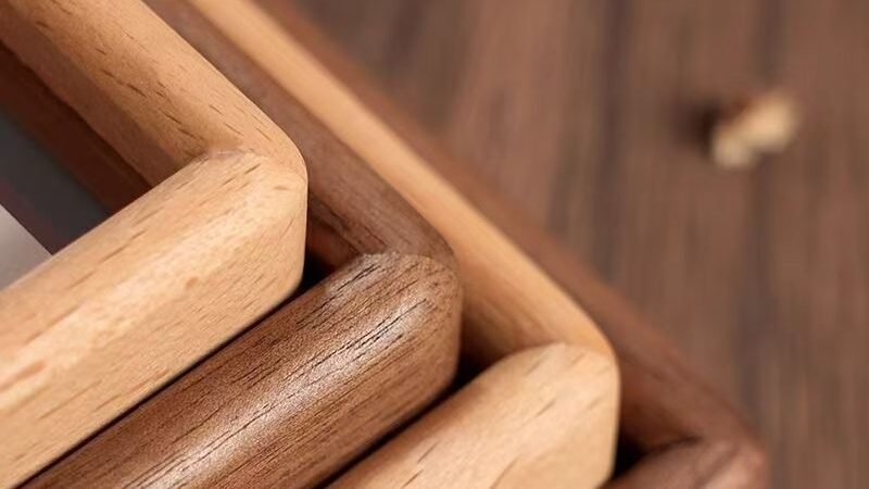
Solid wood is the king of framing. Its charm lies in its uniqueness—no two grain patterns are alike.
- Black Walnut: The nobility of wood. The color is dark chocolate and the texture is clearly mountainous. It comes with a calm and rational temperament.
- Best combination: black and white photography works, minimalist sketches, certificates, or important family photos.
- Lightning protection guide: Avoid pairing cartoon paintings with overly bright colors or high saturation, as they may appear mismatched.
- Oak/Ash: Light and elegant color, clear and rough texture. This is the standard configuration for both Nordic style and Japanese style.
- Best combination: plant-based poster, fresh portrait photography, watercolor painting.
- Teak/Cherry: Over time, the color will become more rosy and deep due to oxidation. This kind of “patina” feeling is very suitable for Mid Century Modern decoration.
Dry knowledge point: Solid wood vs veneer. Many cheap photo frames on the market are made of MDF (medium density fiberboard) with a layer of wood grain paper pasted on the surface. The method of discrimination is simple: look at the cross-section. If the texture on the front and side is “disconnected” or seamlessly connected unnaturally, it is usually adhesive. Real solid wood has a natural and flawed texture at the corners.
2. Acrylic & Glass: The Floating Effect
Modern “floating frames” use double-paned glass or acrylic to suspend the image. This creates transparency and “breathing room” around the photo, making it excellent for smaller spaces where you don’t want visual clutter.
3. Aluminum: Industrial Sleekness
Ultra-slim metal frames (bezels as thin as 0.5cm) are designed to disappear, letting modern architecture photography or abstract art take center stage.
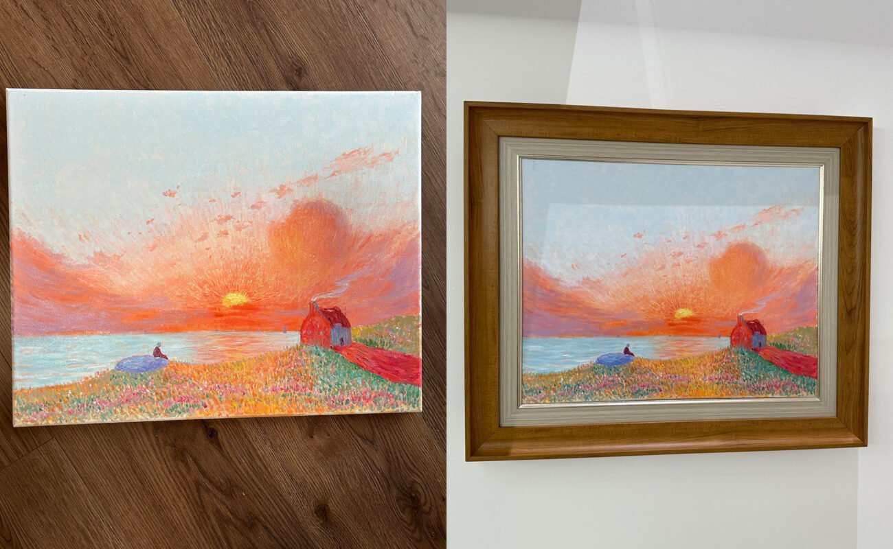
Chapter 2: The Soul of Framing – The Matting
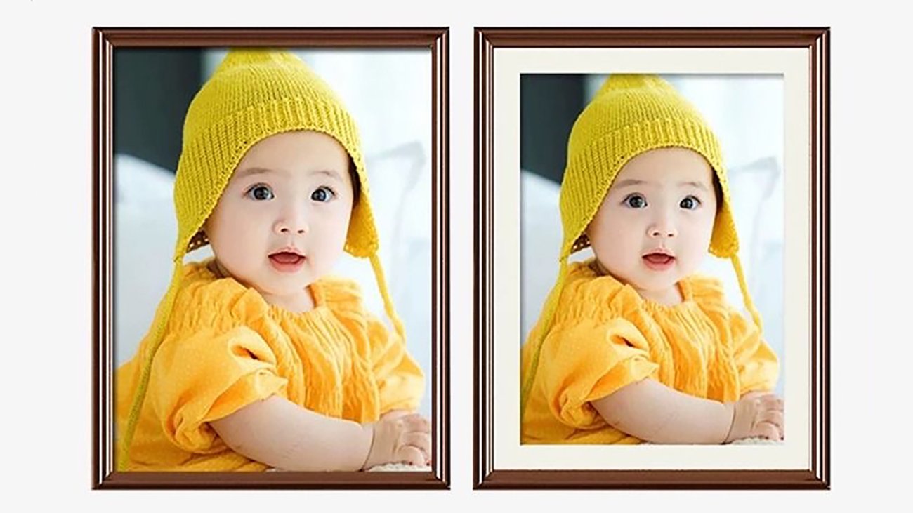
Have you noticed that a photo in a museum looks expensive, but the same photo at home looks plain? The secret is often the white border, known as the Matting (or Passe-partout).
Why do you need matting?
- Physical Barrier: This is the most professional reason. If the photo is directly attached to the glass without Matting, over time, moisture will cause the emulsion layer of the photo to adhere to the glass, resulting in damage to the photo. Matting creates a tiny layer of air that allows photos to ‘breathe’.
- Visual Focus: Matting provides “blank space” for the image. In visual psychology, leaving blank space can isolate the interference of the surrounding environment (such as complex wallpapers), forcing the audience’s gaze to focus on the central image.
- Elevating Status: The traditional art collecting industry is accustomed to using large Matting. Therefore, adding Matting subconsciously tells the brain, ‘This is an important piece of work’.
The golden ratio rule
Don’t be stingy with the width of the matting. A common mistake is that the matting is too narrow (such as 2cm), which can appear cramped.
Suggestion: For small paintings (such as A4 or smaller), the matting width should be at least 4-5cm. For large paintings, the matting width can be 8-10cm.
Bottom weighting method: Professional framing artists will make the bottom of the matting slightly wider than the top and sides (e.g. 5cm on the top left side and 6cm on the bottom). This is to correct people’s visual illusions, as paintings hanging on walls naturally shift the visual center of gravity downwards.
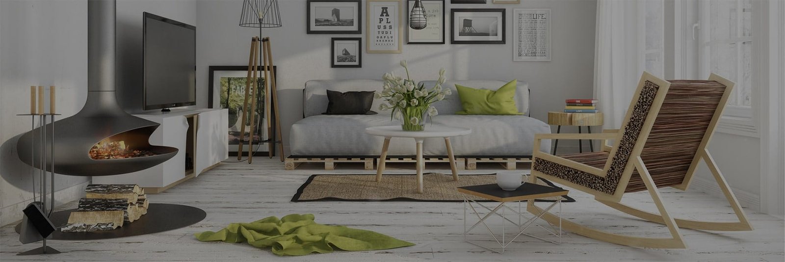
Chapter 3: Display Aesthetics – The Gallery Wall
You have the frames; now, how do you hang them without it looking messy? It’s not just hanging; it’s design.
1. The Grid Layout
- Applicable scenarios: modern minimalist style, obsessive-compulsive disorder patients, photography works of the same series (such as the minimalist rounded corner combination shown earlier).
- Operation points: This layout requires absolute precision. The frame size must be consistent and the spacing must be equal (recommended spacing is 3-5cm).
- Essential tool: laser level. As long as there is one deviation, the overall effect will be ruined.
2. Spiral Layout
- Applicable scenario: You want to display photos of different sizes, but also want to maintain overall balance.
- Operation points: Select the largest main image (Anchor Piece) and place it in the middle, then the other small images will spiral outwards around it.
3. Salon style/Cloud layout
- Applicable scenarios: The most common in European and American families, suitable for displaying content with different styles such as family life photos, travel photos, children’s paintings, etc. (such as the wooden wind combination shown earlier).
- Key points of operation: This layout emphasizes “order amidst chaos”.
- Core axis method: Draw an invisible horizontal line in the middle of the wall to balance the upper and lower paintings based on it.
- Inner frame alignment method: Imagine a large rectangular outer frame, with all photos filled inside the rectangle, with neat outer edges and arbitrary interior.
4. Key Data: Height of Hanging Picture
Remember this number: 145cm. This is the standard height for hanging paintings in museums. It refers to the height of the center point of the picture (not the top of the frame) from the ground. This height is at the level of the average adult’s line of sight and looks the most comfortable. If it is hung behind the sofa, it is recommended that the bottom of the frame be about 15-20cm away from the top of the sofa backrest to avoid touching the frame.
Chapter 4: The Ultimate Installation Hack
Afraid of turning your wall into swiss cheese with too many nail holes? Use the “Paper Template Method.”
- Trace your frames onto kraft paper or old newspapers.
- Cut out the paper shapes.
- Mark exactly where the nail hook is on the paper.
- Tape the paper templates to your wall using painter’s tape. Rearrange until perfect.
- Hammer the nail through the mark on the paper.
- Tear away the paper and hang your frame. Perfect alignment every time!
Maintenance of photo frames
- Wooden frame: Avoid direct sunlight, otherwise dark wood (such as walnut) may fade and light wood may turn yellow. If the house is damp, the wooden frame may mold. You can wipe it with a cotton cloth dipped in a small amount of wood wax oil.
- Acrylic panel: It is an electrostatic vacuum cleaner. Never use a dry cloth to wipe directly, as it may cause scratches. Use specialized anti-static cleaning agents or slightly damp ultra-fine fiber cloth.
Conclusion: The Home is a Vessel, Frames are the Punctuation
In this era of rampant digitization, we swipe through hundreds or thousands of photos on our phones every day, but rarely stop to truly gaze at one. The significance of a photo frame lies in a confirmation of a sense of ceremony. When you print out a photo and carefully place it in the carefully selected solid wood frame, hanging it in the most prominent position at home, you are actually saying to yourself, “This moment is very important to me
Whether it’s DIY graffiti frames documenting a child’s growth or gallery walls showcasing family glory, they are all storytellers of your life story.
I hope this guide can help you find the perfect border to lock in the flowing light and shadow in your life.